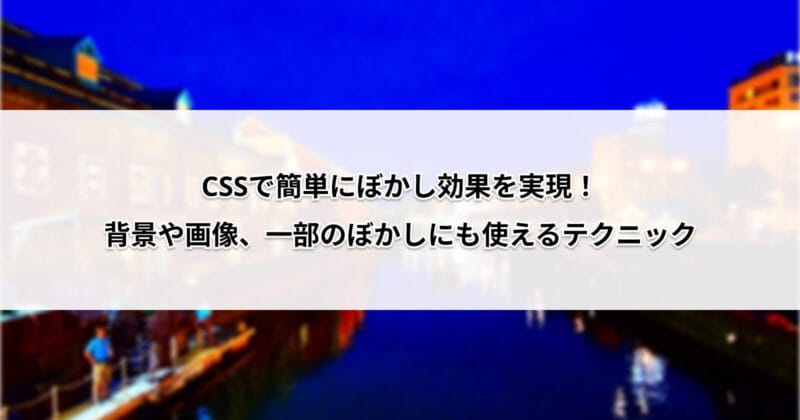
CSSで簡単にぼかし効果を実現!背景や画像、一部のぼかしにも使えるテクニック

2025年11月03日
fvImg
「背景をぼかしたい」「画像をマウスホバーでぼかしたい」といったウェブデザインのニーズは年々増えています。
しかし、実際にCSSで実装する際には迷ってしまうことも多いでしょう。
背景や画像の一部をぼかすには、filterとbackdrop-filterの2種類の手法があります。
本記事では、それぞれの特徴や使い分け、簡単な実装方法まで初心者にも分かりやすく解説しています。

要素全体をぼかす方法『filter: blur()』

  div {
    filter: blur(4px);
  }

filter: blur(px)は要素全体をぼかしたりする、“対象要素そのものを加工する” ためのプロパティです。
写真やテキストなどが入っている要素をぼかしたい場合に使いますが、テキストが見づらくなるので用途は限定的です。
また、下記デモのようにテキスト等が要素外にあった場合はぼかしは効きません。

Welcome to the backdrop-filter demonstration. As the vertical scanning bar moves across the image, you can see how only the background behind it becomes blurred, leaving the foreground text sharp and easy to read. This effect is similar to looking through frosted glass or a semi-transparent window pane. Adjust the blur using the slider below and notice how the intensity changes in real-time. The backdrop-filter property allows designers to create sophisticated visual effects without affecting the clarity of the elements on top. This demonstration highlights the difference between regular filter blur and backdrop-filter blur. While a normal filter would blur the entire element including its contents, backdrop-filter selectively blurs only what is behind the element, giving a polished glass-like aesthetic to your design. Continue to experiment with different values and observe how the interaction between the moving scanner and the background creates a dynamic visual experience. This technique can be applied to modals, menus, cards, and other UI elements to enhance depth and focus in a web layout.
filter: blur(<数値>)
filterが効いている要素とは別の要素
使い方:スライダーで blur 値を変更。
背景画像に直接 filter: blur(…) をかけています。前景テキストは blur の影響を受けません。
※古いChrome、Firefoxの一部では非対応の場合があります。

要素の背後をぼかす方法『backdrop-filter: blur()』

div {
    backdrop-filter: blur(4px);
    -webkit-backdrop-filter: blur(4px); /* Safari対応 */
  }

backdrop-filter: blur(px)はcssを指定した「要素の背後」にある内容だけをぼかします
指定した要素そのものはクリアなままで、後ろにある重なっている要素(背景やテキスト)をぼかすことが可能です。
追従するヘッダー等、一部だけぼかしたい時に使われることが多いです。
古いSafari系ブラウザではbackdrop-filter: blurが効かない場合もあるので、プレフィックス付き(-webkit-backdrop-filter)も書いておくと安心です。
背景が透過していないとぼかし効果が見えないので半透明か透明の要素にするようにしましょう。

Welcome to the backdrop-filter demonstration. As the vertical scanning bar moves across the image, you can see how only the background behind it becomes blurred, leaving the foreground text sharp and easy to read. This effect is similar to looking through frosted glass or a semi-transparent window pane. Adjust the blur using the slider below and notice how the intensity changes in real-time. The backdrop-filter property allows designers to create sophisticated visual effects without affecting the clarity of the elements on top. This demonstration highlights the difference between regular filter blur and backdrop-filter blur. While a normal filter would blur the entire element including its contents, backdrop-filter selectively blurs only what is behind the element, giving a polished glass-like aesthetic to your design. Continue to experiment with different values and observe how the interaction between the moving scanner and the background creates a dynamic visual experience. This technique can be applied to modals, menus, cards, and other UI elements to enhance depth and focus in a web layout.
backdrop-filter: blur(<数値>)
backdrop-filterが効いている要素の上に重なっている要素
使い方:スライダーで blur 値を変更。
枠内に backdrop-filter が適用され、重なった要素だけがぼやけます。
※古いChrome、Firefoxの一部では非対応の場合があります。

ぼかし効果の応用事例

デザインに応用できるぼかしの使い方をまとめました。実装、デザイン提案におすすめです。

すりガラス風の一部ぼかしたエリア(backdrop-filter)

背景画像の上に半透明のぼかしを載せたいときに便利です。

See the Pen css-blur-effect-example-1 by webmagic-lab (@kkindchy-the-selector) on CodePen.

ヘッダーのぼかし(backdrop-filter)

透明なヘッダーが追従してもヘッダーのテキストが読みやすくなります。

See the Pen css-blur-effect-example-2 by webmagic-lab (@kkindchy-the-selector) on CodePen.

ホバーした時に画像をぼかす(filter)

リンクボタンとかでよくあるアニメーションです。

See the Pen css-blur-effect-example-3 by webmagic-lab (@kkindchy-the-selector) on CodePen.

グラデーションで左側の一部だけをぼかす(backdrop-filter)

ここまできたら画像をPhotoshopで編集した方が早そうですが、一応できます。

See the Pen css-blur-effect-example-4 by webmagic-lab (@kkindchy-the-selector) on CodePen.

ブラウザ間の互換性と対応方法

ブラウザfilterbackdrop-filter
Chromever.17以前未対応ver.75以前未対応
Edgever.12以前未対応ver.16以前未対応
Safariver.5.1以前未対応ver.8以前未対応
Firefoxver.3.5以前未対応ver.102以前未対応
IE全バージョン未対応全バージョン未対応
Opera Mini全バージョン未対応全バージョン未対応
Android Browserver.4.3以前未対応ver.4.4.4以前未対応

2025年10月現在、filter・backdrop-filterともに主要ブラウザの最新バージョンでサポートされていますが、古いブラウザでは未対応です。その為、ぼかしが効かなかった時を考慮して半透明で白色等を入れておくとデザイン上の違和感を抑えられます。
backdrop-filterは登場から10年ほど経ちましたが、似たような機能をもつfilter: blurよりも対応ブラウザが少ないです。

▼半透明の白の指定例

.no-backdrop-filter{
    backdrop-filter: blur(4px);
    -webkit-backdrop-filter: blur(4px); /* Safari対応 */
    background-color: rgba(255, 255, 255, 0.9); /* ぼかしなしの代替色 */
  }
最終更新: